
2025
Di Palma’s
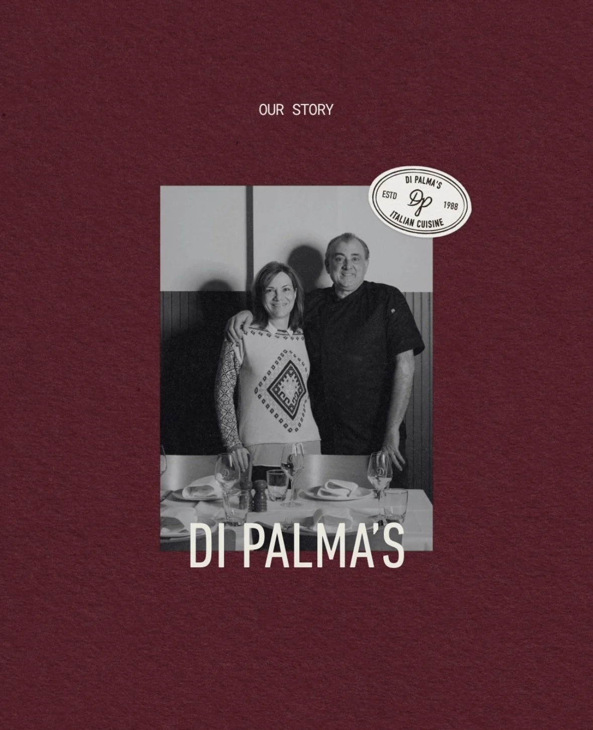
After 35+ years in business, Di Palma’s had built a loyal customer base but felt their brand was starting to look outdated in Melbourne’s evolving restaurant scene. While they remained a beloved local spot, they wanted a brand refresh to attract a younger demographic, without losing the charm that kept their long-time customers coming back.
What We Did
Brand Strategy
Visual Identity
Website Design
Copywriting
Social Media Management
Photography & Videography
Email Marketing
Paid Advertising
The Challenge
Di Palma’s needed a refreshed look that felt up-to-date and inviting while still respecting its heritage and existing identity. The brand needed to feel timeless yet exciting, maintaining an approachable warmth without feeling too formal or overly sophisticated.
The Solution
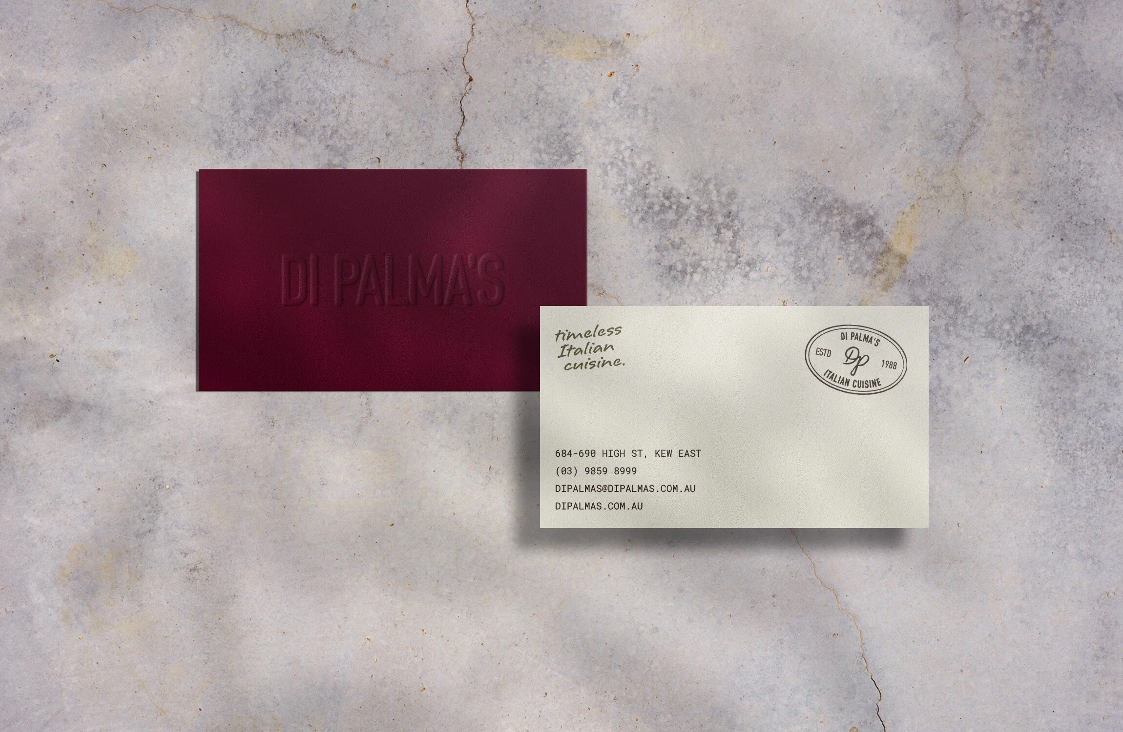
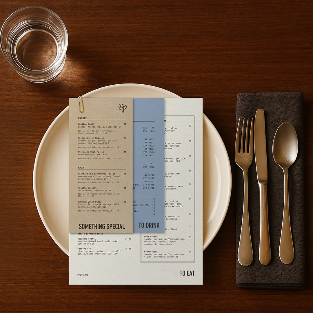
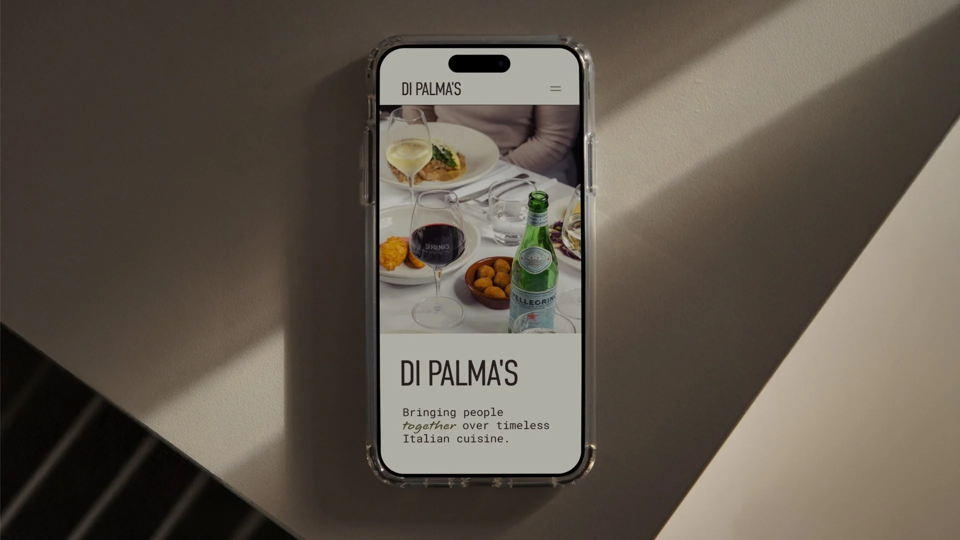
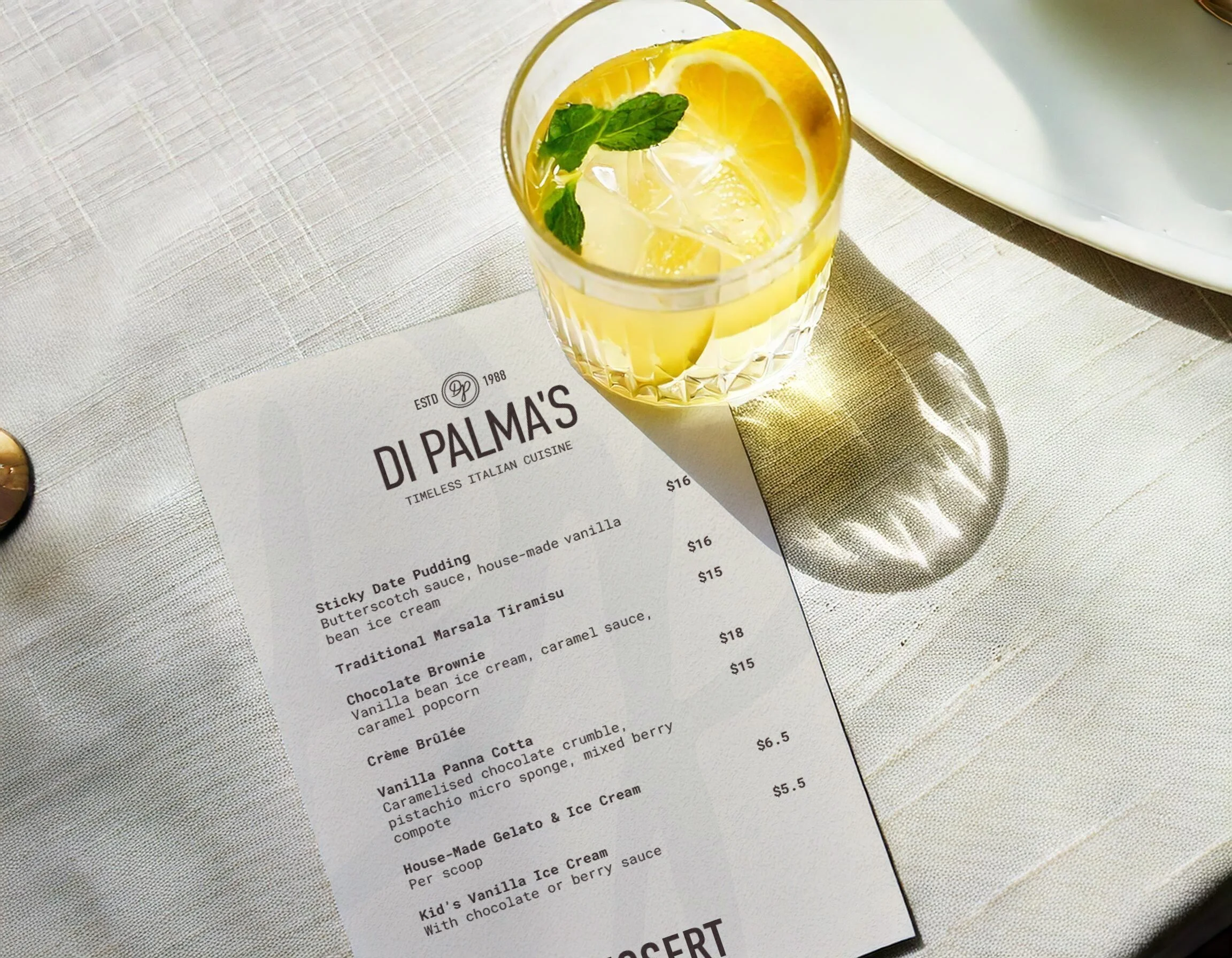
We refined the brand while keeping the original main font as a nod to its history and ensuring a sense of continuity. To stand out from competitors, we introduced a richer, more vibrant colour palette, inspired by the warmth and energy of Italian dining. Many competitors stuck to limited colours, so this new approach gave Di Palma’s a distinctive and inviting presence.
The refreshed look brings a sense of nostalgia with a modern energy, ensuring new customers feel drawn in while regulars still feel at home.
“Katie is an absolute gem, we wouldn't be without her. She has a keen eye for detail, is organised, hard working and dedicated!
Angela | Di Palma’s Manager
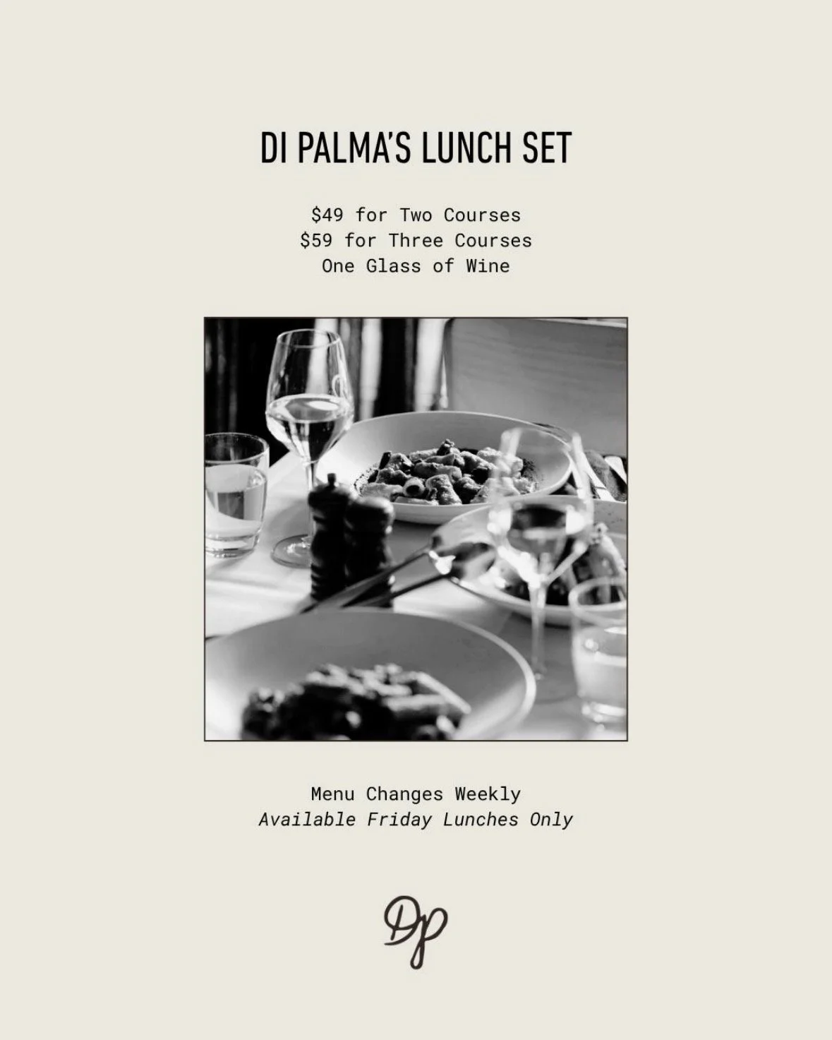
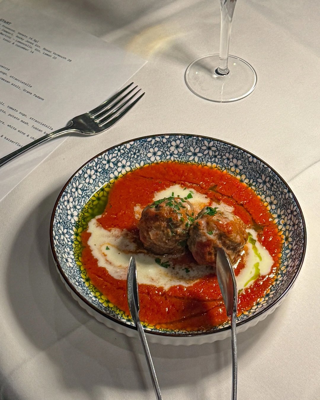
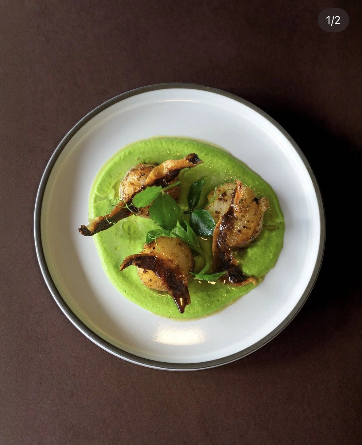
Content Creation