The Daisy Patch | Women’s Gardening Club
Brand Identity, Print Design, and Illustration
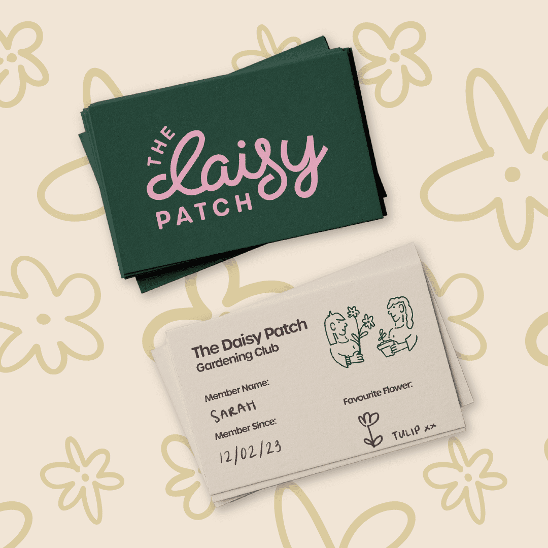
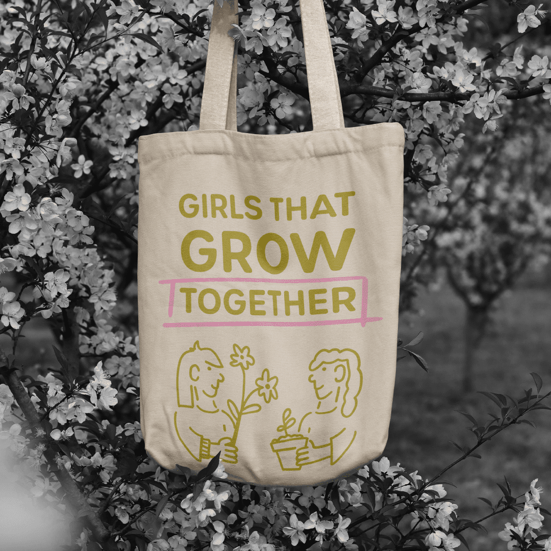
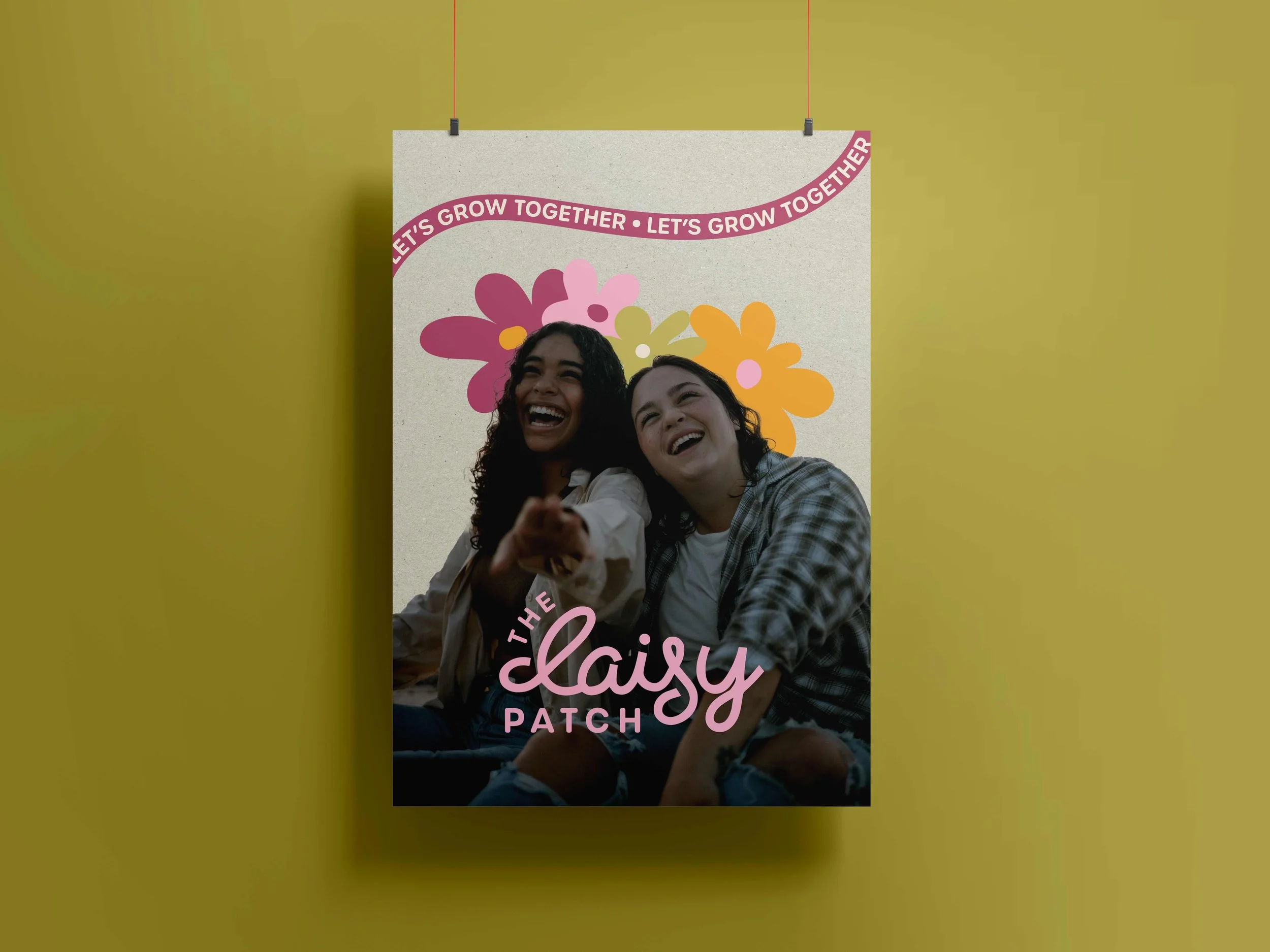
Visual Identity | Business Card Design | Invitation Card Design | Merchandise (Tote Bag) Design | Custom Illustration
The Daisy Patch, a women’s gardening club, needed branding that captured its welcoming, community spirit and the beauty of gardening.
THE CHALLENGE
As a newly formed club, The Daisy Patch needed to establish credibility and attract members without any existing brand presence. The goal was to create an identity that felt both fresh and familiar — something that communicated warmth, connection, and the joy of gardening while standing out from other local community groups.
THE SOLUTION
We developed a brand identity that blends nature-inspired tones of deep green and light pink with hand-drawn details to reflect creativity and authenticity. Positive imagery of women gardening together reinforced the sense of community, resulting in a cohesive and approachable identity that encourages women to connect, grow, and flourish